

At the start of 2011, I was like ‘Alright Megan, it’s time to try something new with your design while you’re still free to experiment’ And after remembering my love of paper, Paper Art seemed like the next logical step in my designing growth!
GRAPHONIC, Design that Speaks, Third Year Grad Show- 2011


Megan Steele Business Cards- 2011

Penguin Book Illustration- 2011


Jaded Minds CD Cover-2011
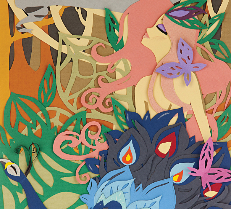
GRAPHONIC, Design that Speaks, Third Year Grad Show- 2011


Above was my design for our third year grad show, GRAPHONIC Design that Speaks. This image was put on the promotional posters and as the cover of our postcard booklet.

This was another concept for the word I had, cutting the letters out of little lanterns and putting tea light candles in them to see the effect light had on the image. Didn't work for GRAPHONIC but still love the image.
Megan Steele Business Cards- 2011
This is my current business card, of course using cut out paper the create my silhouette, and yes the details on the back are just examples :)
Penguin Book Illustration- 2011


These pieces were a portfolio project where I was able to choose what I wanted to do and so chose to create the book jackets for three of my favourite books: Dracula, Alice in Wonderland and Peter Pan. Again I cut the illustrations out of paper, trying to create different covers than what have been made before for these books.

I had the covers printed and then had them photographed as if they were real books. Overall, one of my favourite projects of 2011.
Jaded Minds CD Cover-2011


This piece was for one of my portfolio projects, designing a CD cover, lyrics book, poster etc, for a real or fictitious band. I invented the band Jaded Minds (they’re very indie and alternative, you probably haven’t heard of them ) and from there developed this cut out piece for the cover. I used an old pillow case for the fabric pattern behind the cardboard. I wanted to create a CD cover that I myself would pick up and buy, and I also really wanted to do some new paper art :) Above are the finished CD cover, poster and CD that all used different pieces of paper art.
Conceptual Gin Poster Campaign- 2011

This piece was just more for fun, done on the side to one of my current projects. It is meant to be the poster campaign layout for the fictitious drink Black Lace Gin, I didn’t use it in the end, but it was still good practice for me while I’m still learning how to make paper art effectively.
Pendulum Magazine Cover- 2011

This piece was the cover I designed for a group project, Pendulum Magazine (an online publication of which this was the first issue). The magazine was originally called Howler, and the cover design was left entirely open. Instead of just being obvious and designing a cover based on wolves or yelling, the next thing that came to my mind was a cuckoo clock chiming, and so that is what I designed. I quilled this and then my friend Rosie (who was also a part of the Pendulum team) photographed it and added her own original font. If I saw this cover, it would be something I’d pick up to read.
National Folk Festival Poster- 2011
The National Folk Festival poster was a project from my illustration class this year, and was my first attempt at Paper Art. I wanted to create something vibrant, with movement and a feeling of freedom. The final outcome took three days to bring together, a photo shoot with Rosie and another few hours of Photoshop and Illustrator, but this is one of my favourite pieces of this year as it just turned out perfect in the end.
California Girls- 2011

California Girls was a piece I made as a farewell present for one of my friends. It was based on his birthday and the theme he chose of Katy Perry’s California Girls and showed us four together in the paper versions of our costumes. I’m second from the left.