

Fitness Gone Wilde- for Luke Wilde, personal trainer, brand identity work
Logo


Business card back


Christmas Cards 2011
All colours


GRAPHONIC, 2011 Third Year Grad Show, Identity work


These Images were used for the poster work and the cover of the group grad book.

This image wasn't used, but shows paper art interacting with light in an effective way.
Symposia 2011, Design Forum, Part of the Student Panel


Photo by Elle Pollock
My Business Cards- Current

Nicole Eyles Identity Work- Set Designer, Stage Manager


Jaded Minds Band, Album- ETHERAL design work
CD Cover

Jaded Minds Gig Poster

CD Design

Lyric Book Example (lyrics The Woods by Emmy the Great)

Tote bags and T-shirts

Jaded Minds is my fictitious band for another portfolio project. They're indie, alternative, all girl group and I based the design around the image of a girl and the whimsical world in her imagination.
My 21st Invitations, Front and Back


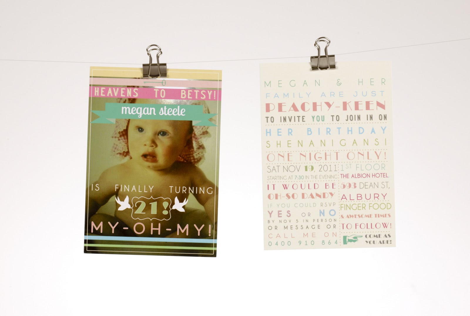
Naturally as a designer, I can' let other people do design work for my own special occasions, such as my 21st. This style of typographic design is one I love and love to do so of course it seemed right to use in my invites, while the language used reflects my love of the good ol' 1950's!
Book Cover work, Penguin Books

Alice in Wonderland

Peter Pan


Dream Job; designing the covers of books, here I chose Dracula, Alice in Wonderland and Peter Pan, published under Penguin Books. I printed the covers and photographed them as if they were real to see their effectiveness.
Pattern work, Peter Alexander fictional "Up & Away" Project
Carousel

I have to create several patterns for my Peter Alexander dream project, and this was my attempt of making a repeating pattern by hand. Difficult to get it to line up properly, but worth learning.

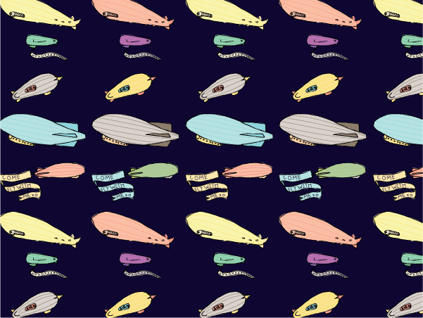

Up & Away


Conceptual Wine- Frere Jacques logoFriendship Balloons
Zeppelins
Planes
Up & Away
Air Race
Cloud Animals
I made a nighty and photoshoped two of my patterns over the top to see how they worked as fabrics.
The Frere Jacques logo was my second attempt at making my own font. It wasn’t for a project, just funzies!
21st Invitation- front & back, for Sarah Fuller

I was commissioned to make the 21st Invitations for a friend. She wasn’t sure what she wanted, all she knew is that she wanted it have natural colours coupled with purple. Oh, and she loves owls. So this was the final invite, front and back, after much back and forth on what she wanted and what I said would look best. She was very happy with the outcome.
Graduation hoodie & t-shirt- green
When I graduated high school, we got graduating jumpers, as I am sure most schools did. Coming up to the end of my University days, I decided I wanted to have another graduating hoodie to mark the end of education phase of life. This was the design I came up with, but as we’re heading into spring now, it may become a graduating singlet.
Face Clinic @ Lavington- Design Competition- Won


Face Clinic @ Lavington in Albury posted an open competition to have their brand identity designed. As the brief was bare, only saying the required information needed, I came up with this piece in more natural colours (browns, greens, creams) and was short listed and asked to re-design in fuchsia and magenta. This was the final logo and business card that won them over.
National Folk Festival- poster

The final National Folk festival Poster was my first attempt at Paper Art, and the beginning of an addiction. It is A3 in size, both the paper version and print version. It was endless fun making this, it was never certain if it would work out, but I’m happy with the outcome.
National Folk Festival- Initial work and font

This was what I started with for the festival project; it was too plain to evoke the excitement I wanted. It was also my first attempt at making a font. I might use the festival font for other things, but in the end I couldn’t use it on the final poster. It would’ve OD on colour.
My Design Identity- logo, business card, envelope

When we were told to design ourselves and our identity’s, I knew I wanted something clean and girly without being sickly cute. I love Victorian profile silhouettes and this was the basis of my logo. Green is my favourite colour so I used the pastel hue of that and I’ve always had a soft spot for the image of birds holding banners of information, and so that made up the final element of the design. I thought I needed a slogan, Why, hello is something I always say to friends, and makes me giggle :D
Pendulum Magazine- Cover
The Pendulum Magazine cover I made using paper quilling. The font was designed by Rosie Taprell.
Pendulum Magazine- Timeline opening spread
For the magazine we all had to do a piece for the ‘timeline’ that is, we each had to design something based on our experiences at specific times on a specific day. I came up with the opening introduction spread illustrations and layout for these articles, creating drawings of what each person did at their time.
Pendulum Magazine- Say Cheese! Spread
My Say Cheese! Article was based around the humble and often forgotten disposable camera. Basically myself and four friends took photos of a colour or shape with a disposable camera. When one person was done it was passed onto the next.
Pendulum Magazine- Red Riding Hood Spread
After being severely disappointed with the new version of Red Riding Hood, I decided to review it for my second article. It only got two red hoods out of five.
Pendulum Magazine- Timeline Piece- Beau Tea
My timeline piece was based around my experience of having a tea party with a friend. The layout for each person’s timeline design had their time in a cuckoo clock (this become our symbol for the magazine) followed by the line that connected to each page. The colours could be changed to work with each person’s spread.
Pendulum Magazine- Promotional Flyer
This A5 promotional flyer I made and gave out around our University to make people aware of our Magazine Launch party. I wanted to make something that was engaging, interactive and funny while still informing people of the event. It was based on the work of Knock Knock Stationery.
Pendulum Magazine- Posters 


These were the posters I came up with to help promote our magazine around the University. Our magazine was about anything and everything, so I tried to show that in these posters.
Emma Ryding Design Identity- logo, business cards, letterhead, envelope, web layout


One of our projects earlier this year was to design the identity of one of our classmates. I was given my friend, Emma Ryding, who is both a photographer and graphic designer. After much back and forth, I came up with this logo that was designed to be clean and simple (her favourite design traits) and the other elements of a full identity design. The business cards were meant to show both her photography and her design aesthetic. She only wanted a simple web layout that showed her work at fully.

L.O.L Magazine- Cover

L.O.L Magazine- Nicole Eyles Spread

L.O.L Magazine was a project where we had to design the cover and three articles, one of which had to be all our own work. I based the theme of my LOL around All the real girls and my original article was based on my friend Nicole Eyles who is studying to be set designer for theatre, hence the article title The Show Girl. This was my first attempt at print design for a magazine, and it was interesting to see how everything had to work together, and what wouldn’t work.
Out 'n' About- Design Identity- logo, business card


I was asked by Nicole’s mother, Lindy, to design her new business Out’n’About Dog training’s identity. All she wanted was the logo and business card, and that the logo be based on type and that the colour scheme be green. I decided to turn the ‘n’ in the middle into a dog being walked by the ‘t’ and made the business cards look like treats to be handed out to potential clients. She was pleased with the final outcome.
Baby Naming Ceremony- Virtue Lables


Being at the age where some of my friends are settling down and starting their families, I was asked to make a present for one of my friends son’s naming ceremony. Not knowing what to do I asked my family ‘What do you give people for a christening or naming ceremony?’ they replied ‘Something that shows your love for that family and hopes for their future’. Oh, of course...
I decided to focus on the ‘hopes for their futures’ part and came up with these labels. As a set of four, they were the virtues I wished my friend’s son to have as he grows into a man; kindness, loyalty, love, and courage. Each label was attached to an old key (which were also engraved with the virtue) and set in box frames to be placed around the baby’s room. The family loved them!
Christmas Cards


As the festive season of 2010 came around, I decided to use my design powers for good, and create my Christmas Cards for my family and friends. Initially it was just the red card, but as the list of people that I needed to give cards to grew, I had to make a set of six. The girl is supposed to represent myself and the sayings come from the movies THE GRINCH and ELF and the Christmas Carol by UK band, THE WOMBATS. They were one of my favourite things that I designed of 2010.