My entry for the Threadless loves weird comp, feel free to vote if you can!!
Saturday, 18 February 2012
Thursday, 16 February 2012
Threadless loves Pinups Contest- entry "Catch of the Day"
Well friends, I've finally decided to get my work out there into comps! Here is my entry for threadless.com's Pinup contest! Please pop over to the site to vote for "Catch of the Day" so my merry mermaid can be printed!! <3
Labels:
illustration,
lovely,
mermaid,
pin up,
sexy,
t-shirt design,
threadless
Friday, 20 January 2012
Fitness Gone Wilde Identity work
Fitness Gone Wilde is the name of Luke Wilde's new Personal Trainer group. I was asked to design him a logo and business card to help him get started. I wanted to create a design that was different from other fitness trainer's cards; no trace of sport or the human figure, and an emphasis on the name only, while still creating something that is edgy, simple and cool.
This is the logo I came up with, joining the letters and adding a unique custom pattern over the top.
And this the front and back of the business cards
Labels:
business card,
fitness,
logo,
pattern,
personal trainer logo,
simple
2011 Christmas Cards
This year I wanted to design my cards using only typography as the graphic element and the lyrics of a christmas carol, my favourite being Carol of the Bells. I made simple geometric patterns in illustrator in various colour ranges and used them to create the final touch.
These were the patterns I made and used
Nicole Eyles, Set Designer/Manager Business Cards
A commission for my friend Nicole to design her business cards. As she's a set designer I instantly thought of using doll house furniture and taking a photo from above, making it look like set blocking for a stage, while the back of the card looks like an identity stamp on blue prints or set designs.
Labels:
business card,
Graphic Design,
photography,
set design
Peter Alexander Pattern work, 'Up & Away'- Portfolio Pieces

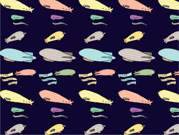
Another dream job piece, designing the patterns for a spring/ summer collection from Peter Alexander based around the theme of 'Up & Away'- vintage air travel and whimsical dreams including planes, zeppelins, hot air balloons, balloons in general, cloud animals and of course, including designs featuring Peter Alexander's love of animals.
I made a nighty and photoshoped the patterns over the top to see how they worked on fabric.
Labels:
clothes,
design,
fashion illustration,
fashion photography,
Graphic Design,
illustration,
night,
pattern,
vintage,
whimsy
Penguin Book Illustration- 2011
This project was a dream job one- pretending I had been asked to design the book jackets for some of my favourite books; Dracula, Alice in Wonderland and Peter Pan. I used my skills in paper art to cut out scenes from the books, then scanned them with a background pattern that complemented the image and the book. The background for the Peter Pan cover was from the Hubble Telescope free image gallery.
I was trying to create covers that were different and unique and something that I'd pick up myself. I had them printed then photographed them as if they were real to see how well they did or didn't work.
Subscribe to:
Comments (Atom)


